From complexity to confidence.
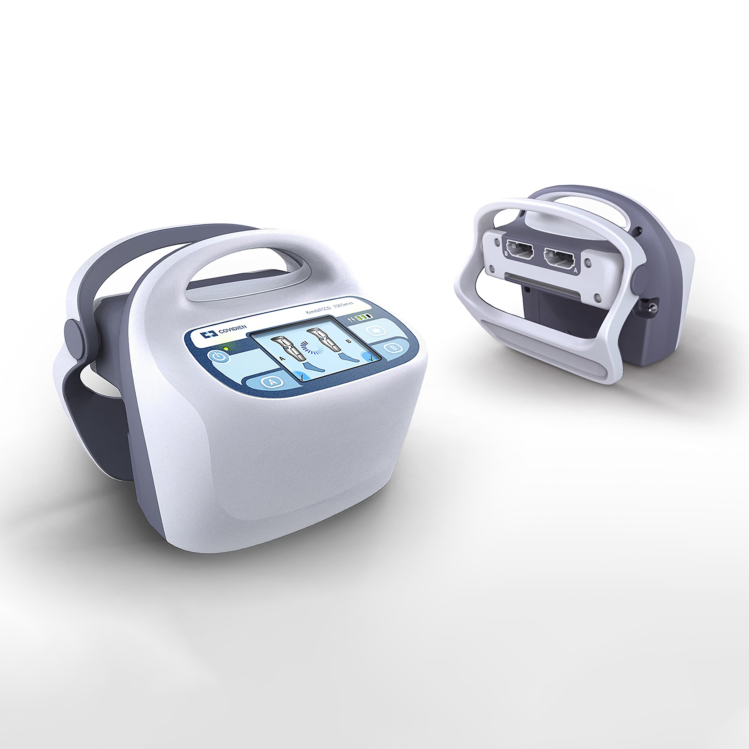
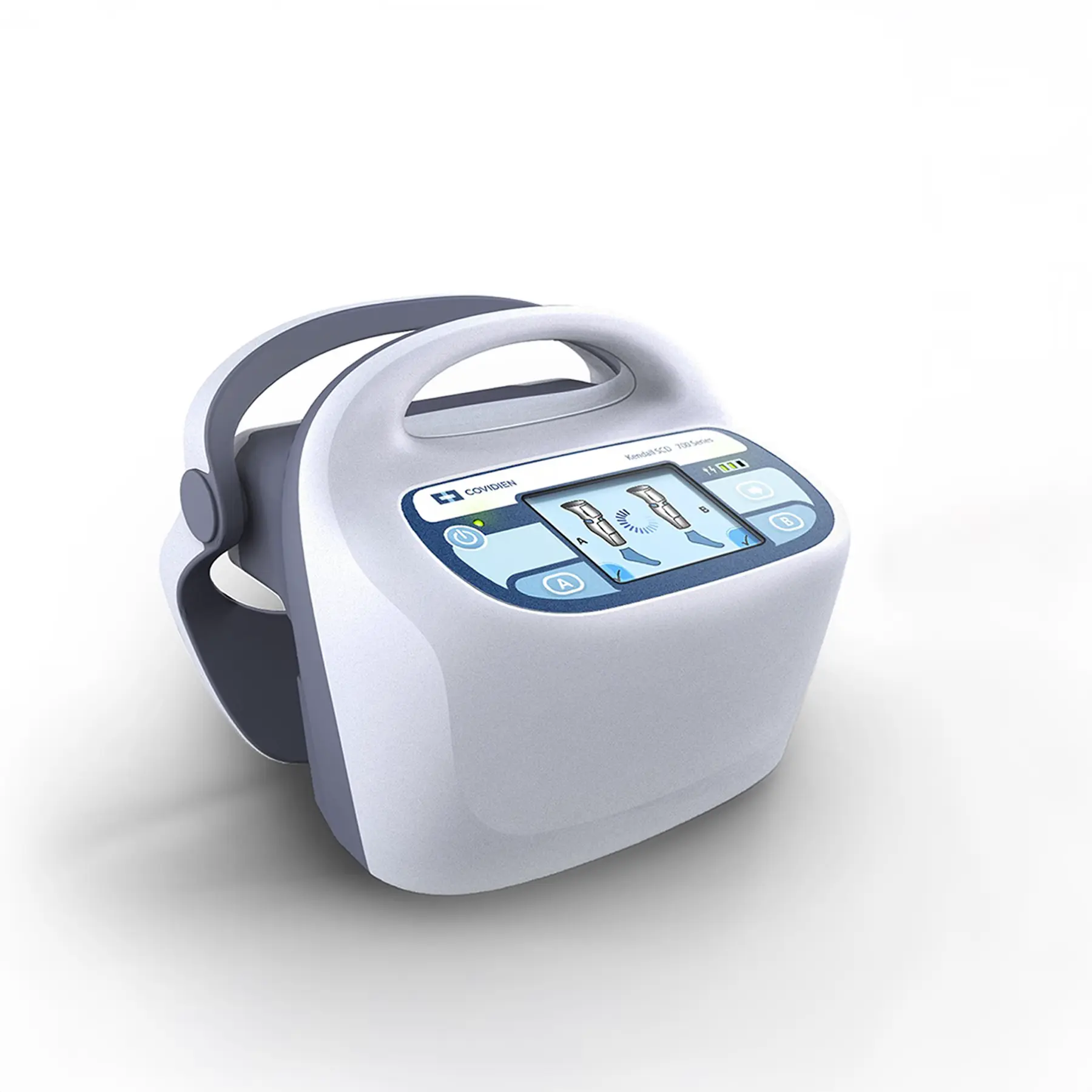
Covidien Kendall
make waves//
The hardware managed the risk.
Trust was earned at the screen.
(the condition)
Deep Vein Thrombosis [DVT] is the third leading cardiovascular killer in the United States. Sequential compression therapy exists to prevent it. The therapy worked.
Keeping it running was the problem.
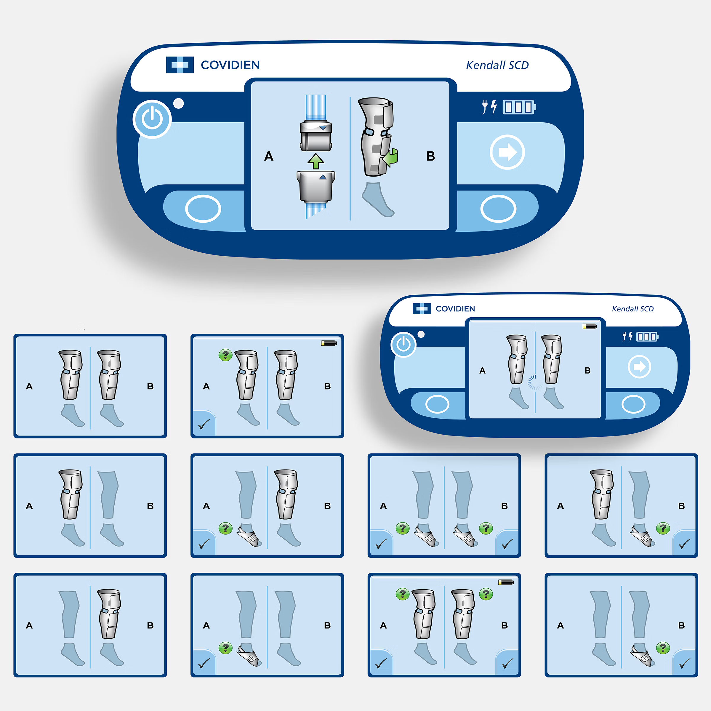
Garment configuration was easy to get wrong.
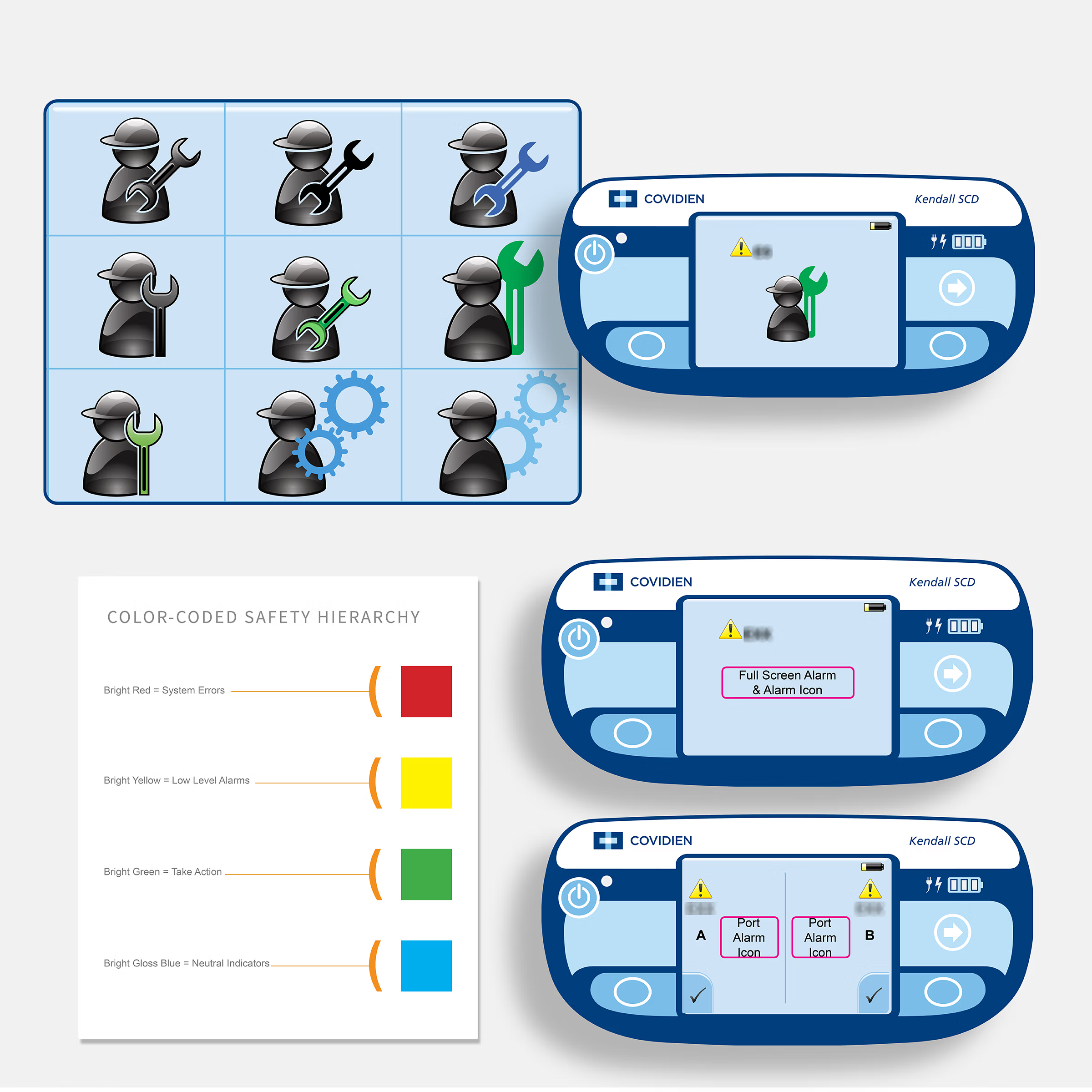
Alarm states were hard to read under pressure.
Therapy got interrupted, misconfigured, or abandoned when the day got busy, because the controller demanded more than the moment allowed.
The brief: redesign the controller for the full clinical journey.
Operating room. Recovery. Ward. Transfer.
Where therapy needed to continue past the hospital door, the device had to travel with the patient. A specialist would not be at the bedside for every interaction.
I was engaged by Farm Product Development, a New Hampshire consultancy, as their embedded UI and interaction design lead. I worked directly with Covidien Kendall's engineering and clinical teams while Farm focused on industrial design and mechanical engineering.
My scope was the controller interface: interaction architecture, screen states, alarm logic, symbols and icon system, garment detection workflows, and the full UI specification for software development handoff.
A compression cycle is the smallest unit of the device.
It repeats thousands of times a shift.
Trust isn't established at setup. It's re-earned every cycle.
And one confusing cycle spends it.
(the diagnosis)
The controller was a mechanism. Pumps, valves, tubing, housing. Mechanical risk held the program's attention, because mechanical risk was what the submission would be judged on.
The screen was treated as a display. Surface, not structure.
It was the only part of the device that spoke.
A clinician touches the interface across a shift, in rooms with variable light and no time. Every claim the program made about safety and clinical fit would be settled there.
Interface development arrives last, on most programs, because software is cheap to change. The reasoning is sound. It fails the moment someone has to use it.
The display was the poorest surface in the device. An industrial-grade resistive touchscreen: pressure to register input, low resolution, narrow contrast, limited viewing angle. The right choice for gloved hands in wet environments. It set hard limits on touch targets, spacing, and how much information a single screen could safely carry.
The device's most consequential surface had the least capability.
This was a material constraint, understood in the way an industrial designer understands the properties of a polymer before specifying wall thickness. Not a limitation to design around. A property to design from.
Three disciplines shared the program and shared very little vocabulary. Resolution meant one thing to a designer, another to a software engineer, a third to an electrical engineer. Intent that could not be specified would not survive the handoff. It would be interpreted.
(the work)
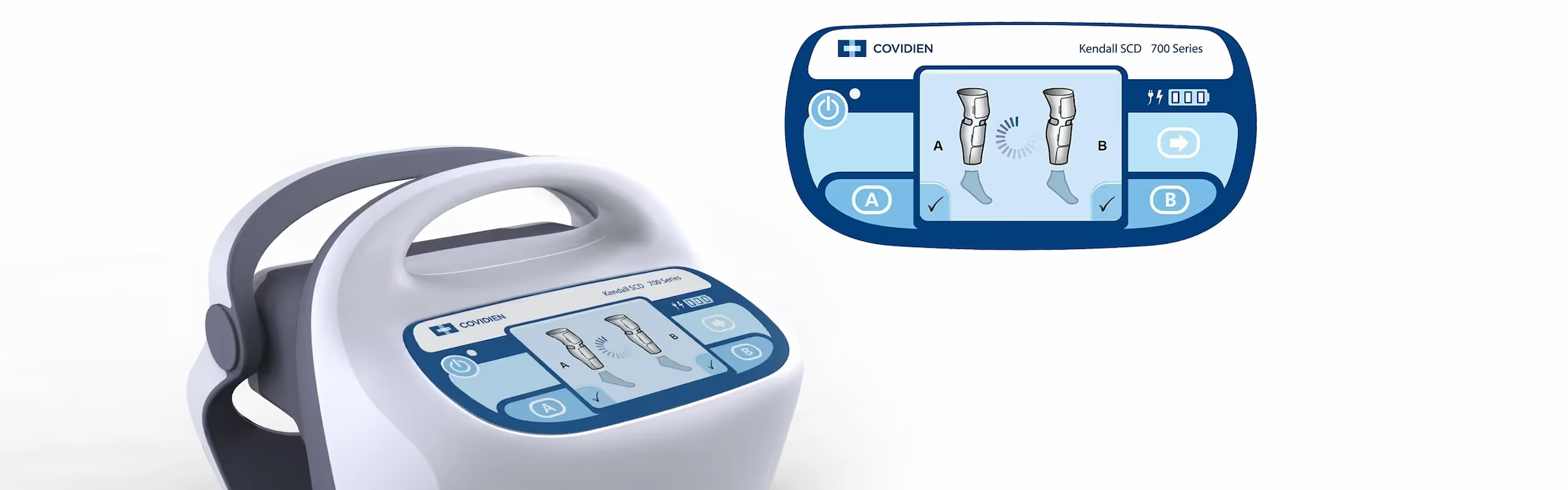
Interaction logic and physical constraint were one problem. The workflow logic mapped anticipated use scenarios, garment configurations, alarm conditions, fault states, and recovery paths. The screen architecture translated that logic into use: navigation, content placement, visual hierarchy, and action controls.
One shaped the other. Neither could be solved alone.
Screen layouts became implementation documents, technical drawings, specified for direct software-development handoff, with little room for interpretation.
Symbol system.
Three functional categories: setup, service, and patient-focused states. Each animated symbol communicates therapy status and alarm conditions at a glance. Calibrated for the display's resolution limits and legible under the lighting conditions of care environments.
Screen state matrix.
A complete map of screen combinations a clinician could encounter during garment detection. Each foreseeable state defined. Each response specified. Each fault given a recovery path back to therapy.
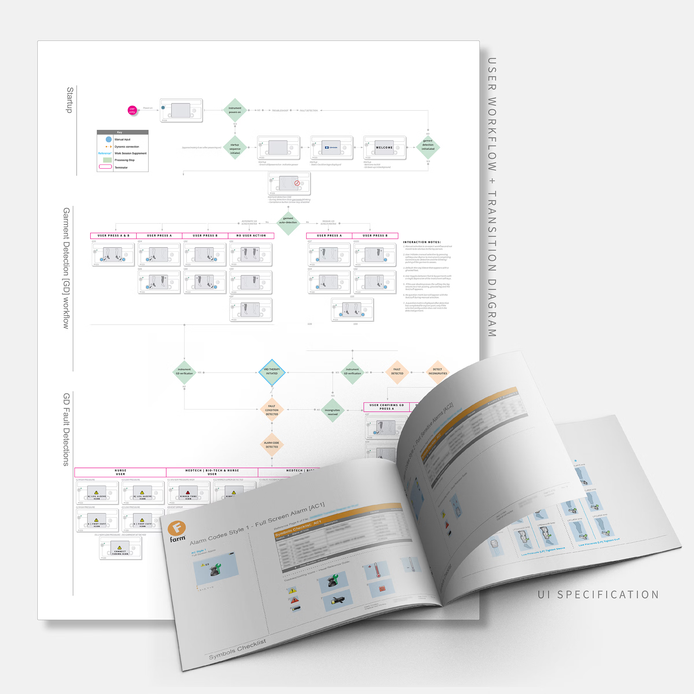
User workflow and transition diagram.
Three workflow layers: startup, garment detection, and fault detection. Foreseeable branches mapped. Each error state with a resolution sequence. Each fault with a path back to therapy.
UI specification.
Formatted for direct software development handoff: screen layouts, interaction states, symbol specifications, alarm hierarchies, transition logic. Built so the development team could build what was designed without filling gaps through assumption.
Interaction architecture.
One-handed operation shaped the interface. Button placement, screen transitions, and alarm responses were designed so clinicians could act quickly, with one hand, in active care environments.
(the proof)
The Kendall SCD 700 received FDA 510(k) clearance in 2010, fourteen months from brief.
A newer platform, the Kendall SCD SmartFlow, has since entered the market. The 700 series remains in active deployment alongside it, in hospitals and professional care settings.
The interface became part of the device's intellectual property: documented and preserved. Usability was built into the product rather than layered on top.
Fifteen years in use is what trust looks like. It was built interaction by interaction, quietly, without the device getting in the way.
The specification was not requested. It documented every screen part, symbol, animation frame, coordinate, font, and hex value required to build the interface. Farm asked me to teach the method to their staff.
The visual language was built to be extended. It persists in current marketing for the SmartFlow, a platform launched years after the program ended.
Complexity stayed in the device. Confidence went to the clinician.
(the numbers)
Active clinical use
Still in hospitals. Still in use.
Speed to clearance
From brief to 510(k) in fourteen months.
(the evidence)